Create a Logo in 6 steps
Apple, McDonalds, Twitter, Coca Cola, Nike. What makes your logos so iconic? Are they the colors or the shapes? Why do we remember them? Do they explain what the company does? or not?
All of this is taken into account when creating a logo, but none of these reasons is important. Some logos are especially pretty and others not so much. A few suggest what the company does while others do not. And if you look at the colors you will realize that there are no rules.
If none of the above questions are important when creating a logo, what is important?
In this post you can find out more about the characteristics of a logo:
For a logo to be consistent and successful, it must conform to the fundamental design principle where “less is more”. Such simplicity allows it to be:
- Readable – down to the smallest size.
- Scalable – to any required size.
- Reproducible – without material restrictions.
- Distinguishable – both positive and negative.
- Memorable – impact and don’t forget.
From here, we will focus on the 6 necessary steps when creating a logo:
That the logo is different
Table of Contents
It is without a doubt the most important and most difficult trait to get in a professional logo. If it stands out from the rest and makes the brand unique and unforgettable as long as it respects some basic design principles, you can rate it as good.
How do you make a logo different?
Documenting about the client
A good logo is the joint expression of the values, culture and people that make up a company. Let’s think of the logo as one more employee of a company, its main job is to be distinctive and represent the company in the best possible way.
That is why the best logo designers have quality conversations with their clients. Their intention is to learn as much as possible about the culture, the values and the way of doing business that the company has, from there they try to instill the message in the logo design.
To make a good logo, it is very important that in the first meeting with the client they explain who they are, where they are and what values they want to transmit with their brand.
Documenting about the competition and the target
Once we are familiar with the client, we need to know more about their competition and their target. In other words, we look at things like:
- Against whom the company competes (competition)
- Who is it for?
Knowing the audience can serve as a guide for various aspects of the logo, such as style. For example, if we work for the real estate market, we probably need something serious, timeless and not too strident, since it is aimed at an adult audience. If a technology company visited us, we would have to take into account that the trend is blue or cold colors.
This is why we need to ask our clients who will see their logo. Questions like: who are they, where do they live, what do they buy, how do they dress, etc. The more we know about the audience, the easier it will be to make decisions to create a logo for that specific target.
Another part, and perhaps the most important in this process, is to know our client’s competition. We need to see who else is out there and what their logos are like, so we will avoid doing something similar. Remember that your logo must be distinctive, it cannot and should not resemble anything, least of all the direct competition of our clients. So we always create a list of competitors to be able to research and consider different options.
Logo applications
In this phase we should answer the question: How and where will the logo be used most of the time? We refer to the uses that will be given to that logo.
This process is essential, as it tells the designer what to do with the logo from a design point of view. We must always bear in mind that the format often conditions the design. In other words, depending on the places where the logo will appear, we will design it in one way or another.
For example, airlines need a very specific logo application: the logo has to go on the rudder (tail of the plane), it is a very specific space to work, therefore designers have to adapt and develop ideas that fit in that space or generate separate graphics that can be used specifically for that purpose.
Another clear example is online companies, which focus their business on the Web. In this case, the designer should use a full spectrum in RGB, since digital devices do not have any problem with RGB and can help the logo stand out. On the other hand, this would be a terrible choice for a company with offline businesses and must print its logo in various formats such as packaging, brochures, catalogs, etc.
With the arrival of social networks, it is normal to find more square logo designs, so we usually recommend our clients to create horizontal and square versions, which can be adapted to the new Internet formats. This would be an example of one of our templates:
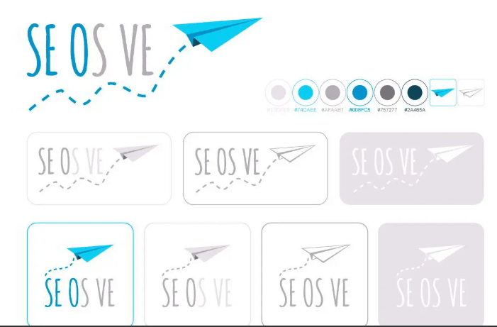
For all these reasons, you have to think carefully and ask yourself how the logo will be used, so no time is wasted on ideas that cannot be perfectly executed in practice.
Sketching or sketching phase
Some design schools ask their students for up to 100 different ideas before making the final decision about creating a logo. The reason is simple: the only way to separate the good ideas from the bad is to have plenty of options to choose from. Because of this, professional designers typically make dozens of sketches during the sketching phase, then pick a few and show them to the customer.
It is better not to delude yourself into thinking that the first sketches are the best. It is good to work for several days on the same project in this phase, to arrive with a clear head and look at the proposals more objectively. This is how the pros do it.
Choice of designs
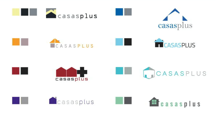
When the sketching phase is complete, we pick 8-10 of the best ideas and create some initial designs with Illustrator or any other vector-based application. As a reminder, the best ideas are not the most beautiful, or the safest (which probably resemble logos of other companies), but the ones that make your client stand out in the market.
In the case of seosve, we like to make 1 meeting with our clients to present proposals and, according to the comments they send us, hold another second meeting to select between 6 or 7 sketches that we know will be much more suited to the idea that have. Sometimes clients do not know what they want and it is much easier to rely on images to make decisions.

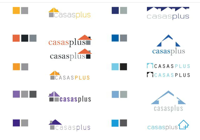
Better to focus on ideas than small details. Our main objective in this phase of the design is to collect customer feedback in order to identify which ideas they like the most in order to perfect them.
Perfecting the selected idea
The refinement phase is perhaps the longest because it involves a lot of trial and error and changes in the selection of logos presented to the client. Sometimes the client will choose only one idea to perfect it, other times he may choose two or three in parallel just to see how they are finished.
Logo details and singularities are added, changed, or removed during this phase. Mockups of applications can be made to see how the logo will work in different situations. Sometimes a detail that stands out for the Web will not stand out in large formats such as billboards or canvas on buildings. And the same can happen in reverse.
Finally, the definitive logo is chosen, approved and prepared for the development of the corporate identity.
Basic files to deliver to the client
We understand that this already designed logo will be used for a multitude of applications in the coming years. If all goes well, the client will trust us to design these applications, but it may be that for certain projects they trust other professionals.
In order for them to operate, it is very important to provide customers with the logo in .ai (or another vector format) and in .pdf. It is also interesting to provide the list of Pantone Colors (if used) and Web colors. Web colors are specified with a 6-number code preceded by the # symbol.
Corporate identity
As you can imagine, a good logo is the beginning of a great corporate identity.
Letterhead, signage, vehicle branding, and other communication tools need to be designed together to suggest a unified brand message. The corporate identity makes all this possible, since it has a higher cost than the simple design of a logo.
In this way companies ensure that their identity is protected and guided by the same principles even if they change designers or agencies.
Have you already designed your logo? Does the creation process meet all these characteristics?
